


使用react实现一个tab组件的方法:1、通过“export default props => {...}”方式创建TAB button组件;2、通过“tab-group-layout.js”组件来传“tabIndex”,并设置默认选中的tab效果;3、用react继承“react.component”组件里的onMouseOver和OnMouseOut方法即可。

怎么使用react实现一个tab组件?
react写Tab组件
使用react写TAB栏组件和对应hover事件(背景:在用gatsby开发页面时,遇到这样的组件效果,顺便记录一下)
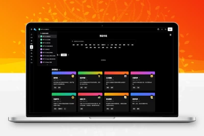
1、效果
默认选中的tab选中效果 和 鼠标放上去的hover效果
当鼠标滑过右侧的tab时,也会有和第一个一样的选中效果!
2、tab-button.js 组件
import React from "react"import { css } from "@emotion/core"import { Link } from "gatsby"import jdyStyles from "./container.module.css" // TAB button 组件export default props => { return ( {props.children} )}3、tab-group-layout.js 组件
import React from "react"import { css } from "@emotion/core"import { Link } from "gatsby"import ListLink from "../components/tab-button"import RegisterButton from "../components/round-button"export default ({ tabIndex }) => { return ( {/* tab */}产品介绍成功案列服务支持资源中心
)}使用这个组件传过来 tabIndex 设置默认选中的tab效果;也可以自己处理展示的逻辑
4、对应的css样式 container.module.css
.header_hover{ color: #333;} .header_hover_default{ color: #0084ff!important; border-top: 3px solid #0084ff;} .header_hover:hover{ color: #0084ff!important; border-top: 3px solid #0084ff;}5、当前组件的hover使用的是css样式控制,也可以用 react继承 react.component组件里的onMouseOver和OnMouseOut方法来实现
你可能想看:


 琼ICP备20002778号


发表评论
共有[ 2 ]人发表了评论